We would just like to tell you about a recent project we have been working on (apart from the neverending re-design of our website that is!) that has recently been completed. The brief was to design new branding, a flyer and menu for the re-opening of The Queens Head pub in Eye, Stradbroke, Suffolk. The new landlady had a colour scheme in mind for the interior decor of the pub and so the flyer and menu needed to reflect this. They were after a vintage feel for the new branding, and a friendly, family pub appearance that would appeal to both the locals and visitors to the village.
We decided on using this established looking serif font for the pub logo which will be used on signage, the website, literature, menus etc. It shows that the pub is a traditional pub, but we also think it’s a vast improvement on the font currently used on the sign for the pub.

The flyer was to promote the opening weekend, tell people a little bit about what would be on offer, welcome back the locals and tempt people to come try out the great food – something the pub has not done for a long time!


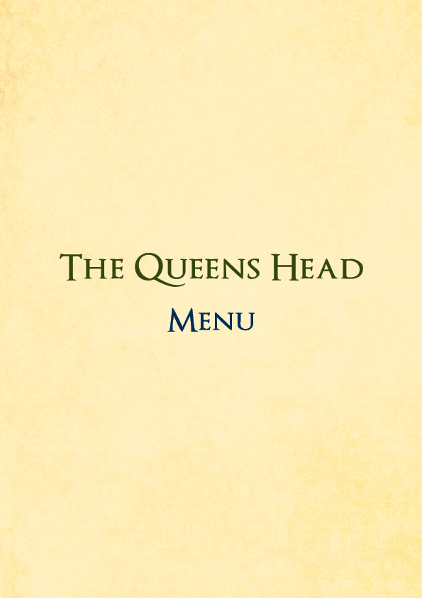
The menu was of course then completed in the same styling, we think the food all sounds great and will be travelling down to try it out for ourselves!


By all accounts we have heard that the pub had a GREAT opening night enjoyed by all, and we wish Jacqui and Dan the best of luck in their new endeavor. If any of our readers are in the area, do pop in and say hi!
